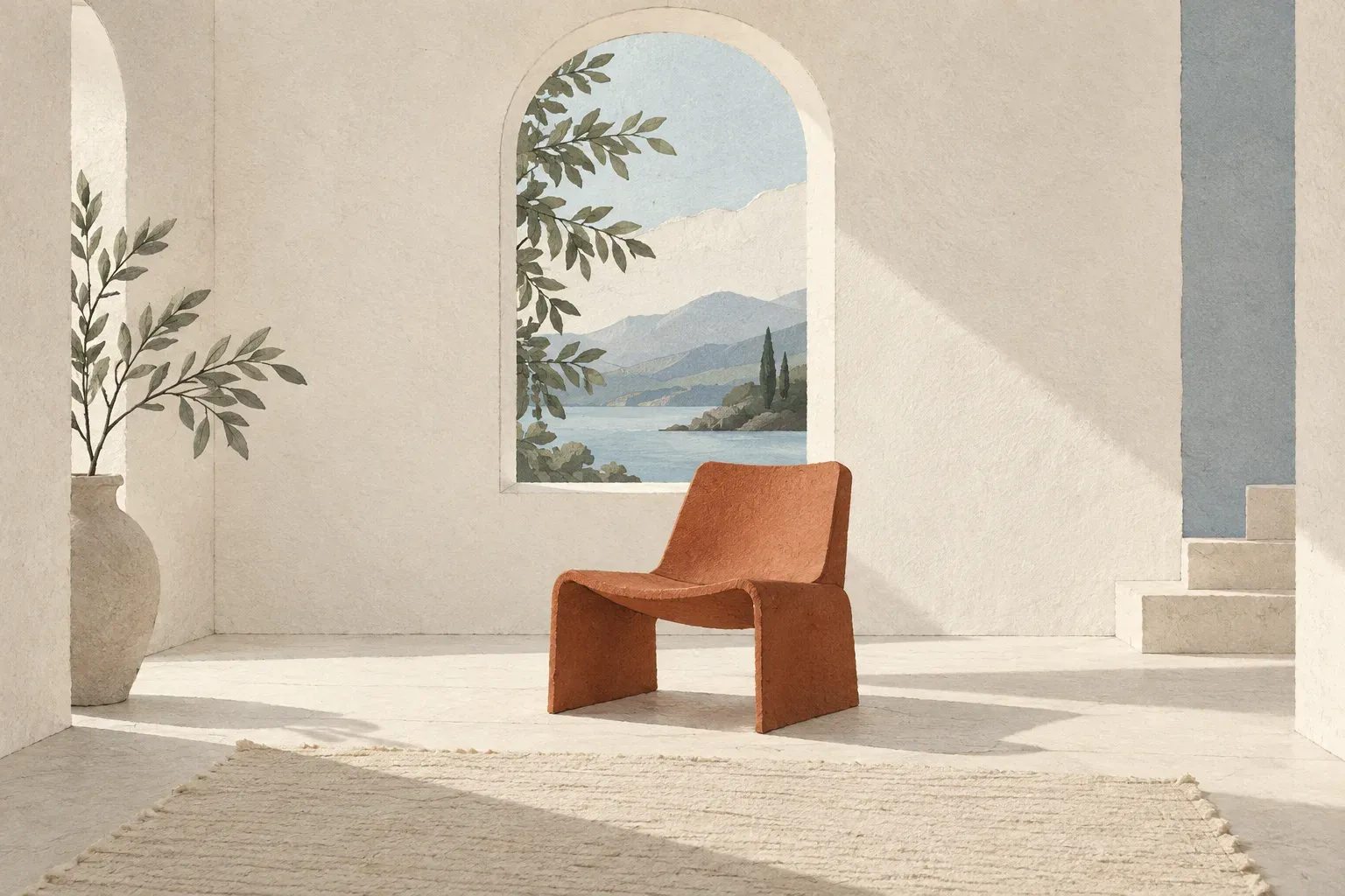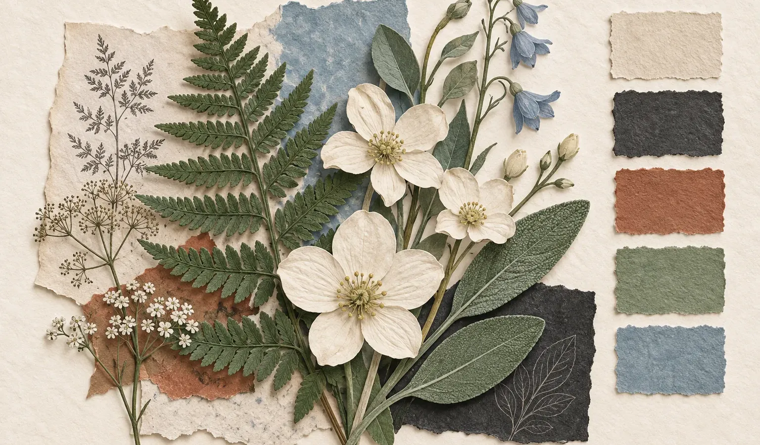
This sample color study uses an invented garden as its starting point.
Collect before you choose
The garden offered more colors than the notebook needed. There was the pale underside of a leaf, the dusty red of an empty pot, and the deep gray of wet stone. Instead of collecting all of them, the sketch kept four.
A small palette can make a page feel related to itself. The colors do different jobs: one holds the background, one carries the words, and the others bring attention to the details.
| Name | Sample value | Role in the imagined palette |
|---|---|---|
| Paper | #F4EEE4 | A warm, quiet background |
| Ink | #282824 | The main written voice |
| Clay | #A8492E | A small accent |
| Sage | #858D79 | Illustration and supporting shapes |
These values describe the illustration study, not a promise that every pairing works for interface text. A color swatch and a readable button have different jobs.
Give each color a task
- Let the palest color occupy the most space.
- Use the darkest color to anchor the composition.
- Repeat the accent in a few meaningful places.
- Leave some areas undecorated.
Bring it back to the page
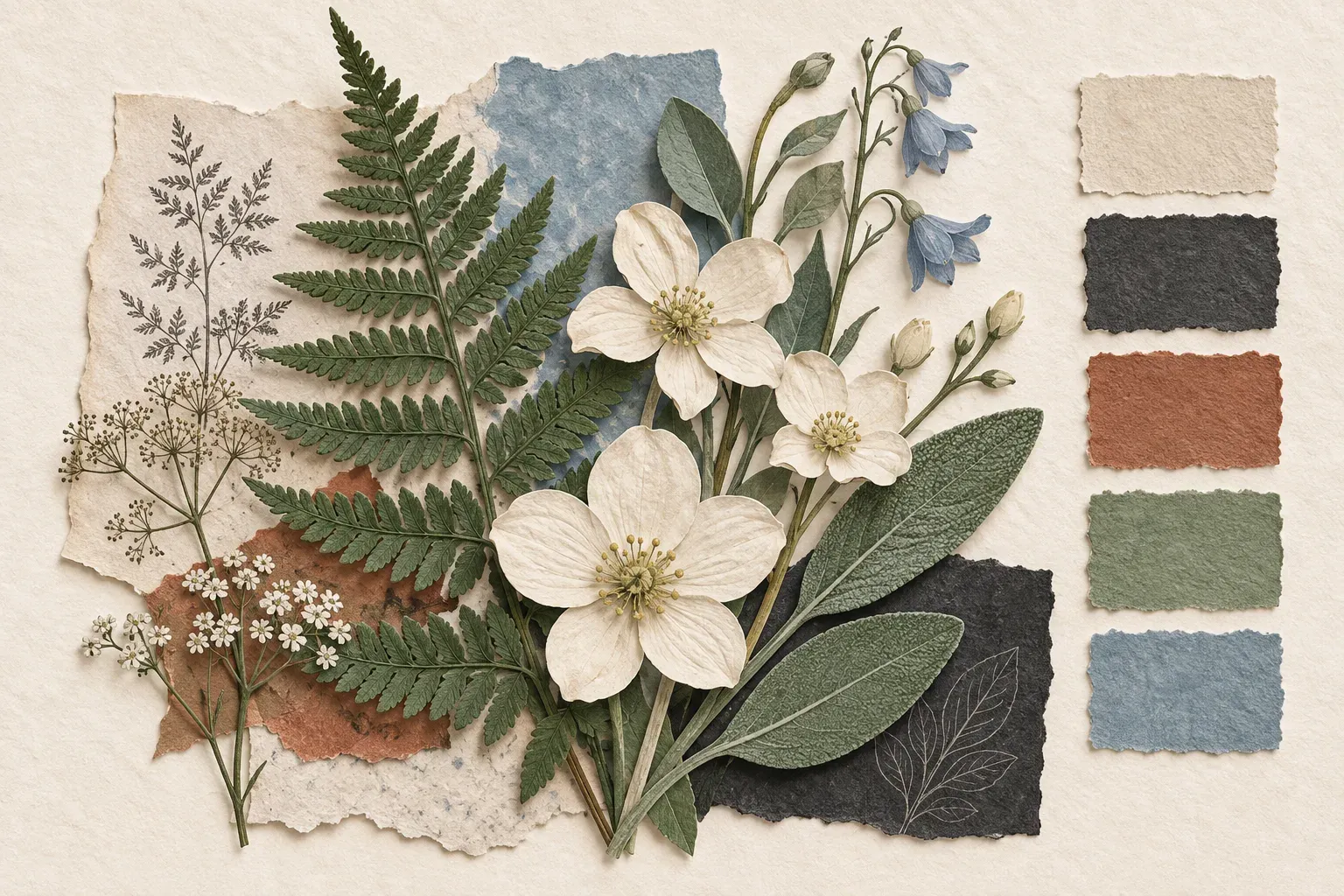
The most useful part of the study was the limit. Four colors were enough to suggest the garden without trying to reproduce it. The notebook could remain a notebook, rather than becoming a catalog of everything outside the window.